MyRealFood Brand Refresh
& Design System
Company
MyRealFood
Year
2022
Role
Branding
Product Strategy
Design System
User Research
Illustration
Iconography
MyRealFood stands as Spain's leading app for a healthy lifestyle. The app features a community of over 2 million users who share recipes based on real food, offer advice, and provide mutual motivation. Additionally, the app enables users to assess the nutritional quality of food through barcode scanning, providing nutritional information for recipes as well.
Overview
My Role
In the MyRealFood Rebranding, I worked closely with my Graphic Designer Colleague, to transform the brand's visual identity.
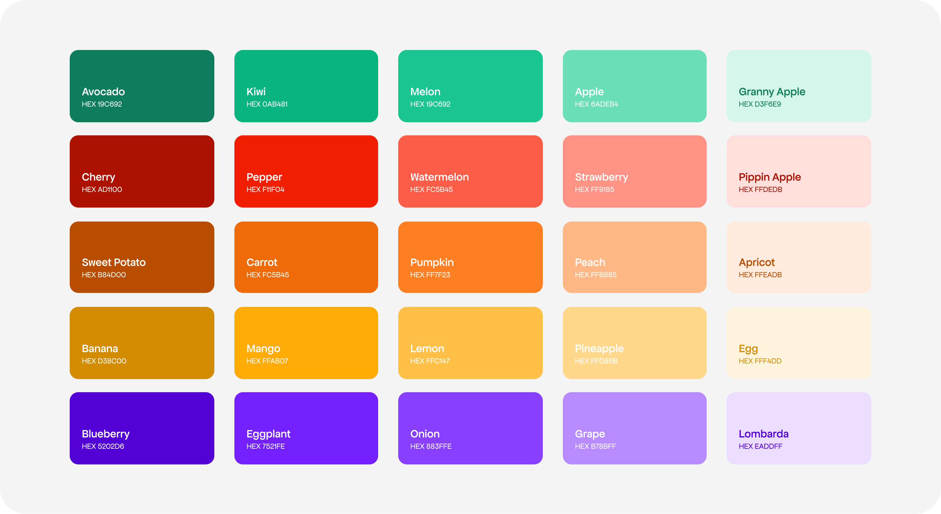
Together, we developed all brand’s visual assets such as the Logo Suite, iconography, color palette, patterns and other graphics. We created a branding style guide for unified usage across the company.
Business Goals
During the rebranding process, we met with company leaders to understand their goals, values, and vision. This helped us tailor the rebranding to their objectives.
We discussed topics such as the company's identity, its audience, and the current perception of the brand. We used these insights to develop visual elements and messages that faithfully reflected the essence of the company across all brand touchpoints.
Discover & Define
Current situation
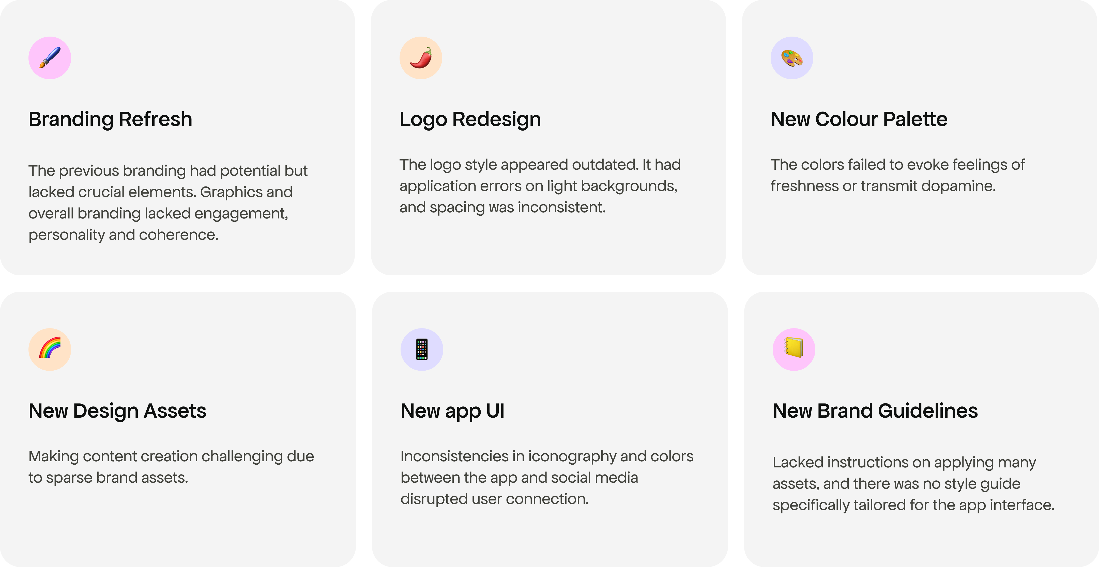
Below, we can see examples of assets from the previous branding, including color patterns, a limited set of icons, and icons used in the app that didn't match the branding colors.
Deliver
Brand purpose & mission
MyRealFood's mission is to make people's lives healthier by spreading the Realfooding philosophy. They believe that through technology, they can motivate people to achieve their goals and help them change their eating habits and lifestyle.
Brand values
The core of the brand is a dedication to user-centric principles.
This are Make it empowering, Inspire community and Be real and honest.
Logotype & Typography
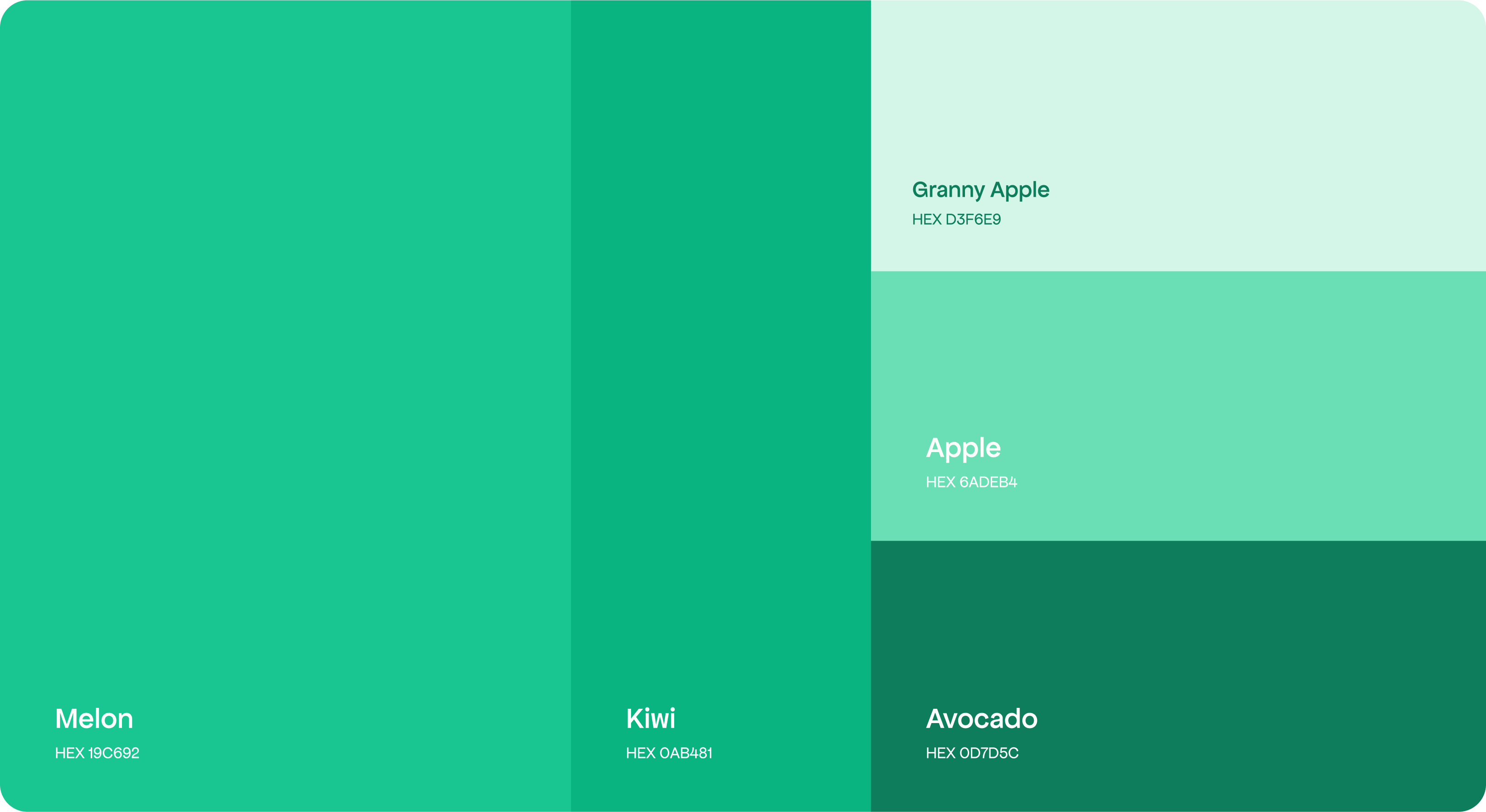
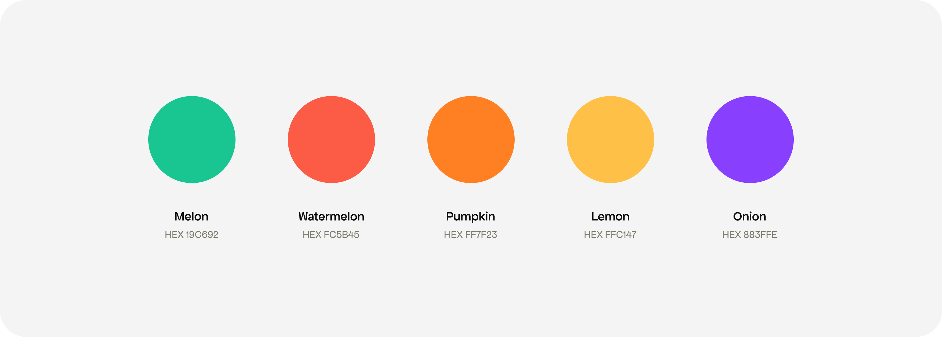
We crafted a new logo typography, adjusted spacing, and refreshed colors to match the updated Branding palette.
The Pepper isologo
We updated the pepper isologo, maintaining its familiarity while injecting a fresh, contemporary vibe. Our goal was to preserve brand recognition and user affinity with the iconic emblem and red color scheme.